KEY JUDGMENTS
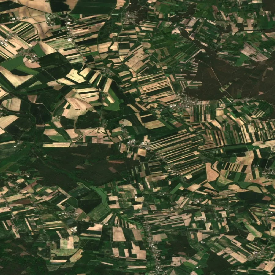
- The decisions land before the number does. Prices, premiums and loans all depend on the harvest, but the harvest itself isn't counted until the crop is already in the barn — by which point the positions that needed that number were taken months ago. Reading the field through the season pulls the moment of knowing forward, into the window when something can still be done about it.
- The honest forecast is a range, not a point. Low, expected and high case, where the width itself is information. A tight band means a confident field; a wide one means an exposed one. What a client actually needs — the probability of loss — is just the share of that range sitting below their threshold. A single number can't carry that.
- The regional figure is validated; the parcel read is an estimate. A field-level reading is useful for ranking fields and flagging trouble, but it picks up more uncertainty the finer it gets. What's actually been checked against recorded harvests, region by region, is the regional number — that's the one you can stand behind.
- Outlook — a band drawn too narrow fails exactly when it matters most. Skill on one landscape doesn't automatically transfer to another, and a forecast that was tuned but never verified can behave erratically under the drought or heat spike that actually drives the claims. The check for this is straightforward in principle: a band claiming ninety-in-a-hundred coverage has to hold that rate across many fields and many years, or it's just selling false confidence in the tails.
Why the harvest is counted too late
Few numbers move whole economies the way a harvest does, and few arrive this late. How much grain a country brings in sets the price of bread, the cost of feeding livestock, the size of the import bill, even the politics of food. Markets trade on it. Governments plan budgets around it. Lenders and insurers quietly carry the risk of getting it wrong. And the number everyone is waiting for doesn't show up until the crop is already sitting in the barn.
By then, the decisions that actually needed the number have already been made. An insurer sets the premium before the season starts and pays the claim after it ends — against a crop that spent the whole summer in the ground. A bank lends against a field that's still weeks from ripe. A grain buyer takes a position long before any official estimate exists. All three are betting on a quantity that, at the moment they commit, literally cannot be counted yet.
The forecasts that try to fill this gap tend to be blunt instruments. They report a region or a country as one single average — fine for a ministry, close to useless for a contract. Hail flattens one valley and skips the next. Drought bites the south-facing slope while the low ground holds up fine. A waterlogged corner produces nothing while the rest of the same field does perfectly well. Averaging across all of that erases exactly the variation that decides whether one specific policy pays out or one specific loan goes bad.
What a field tells you from orbit
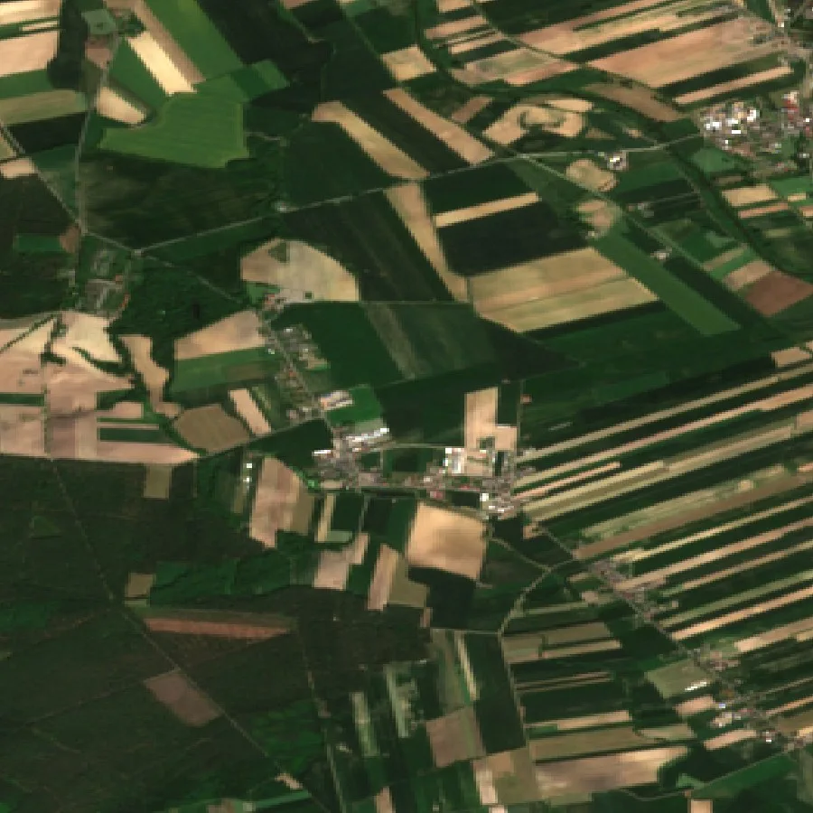
A crop gives itself away long before harvest. Over the course of a season it greens up, thickens, sets its grain, fills it out and ripens — and each stage leaves a mark that's visible from above. From orbit, what we're reading is the crop's condition as the season unfolds: how vigorous the canopy looks, how much water the plants are actually finding, how growth is tracking against the calendar. Optical layers pick up the colour and density of the leaves. Radar sees through cloud to the structure underneath. Put together, they build a running record of how the field is doing, updated every few days.
That record only really pays off when you read it against time, not as a single snapshot. A green field in May means something different depending on whether the year started warm or cold. What actually matters is the shape of the season — is the crop ahead of or behind schedule for this date, has a stretch of heat or drought bent the curve. Grain forms through a sequence of gated steps, each needing water, warmth and light in roughly the right amounts, and the orbital signal traces that sequence as it's happening, not after the fact.
None of this is the same as photographing the harvest itself. It's reading the conditions that produce it, while there's still season left to run. Generally, the earlier in that arc you can read a field, the more valuable the reading is — and, honestly, the less certain it can responsibly claim to be.
The optical side of that record has fixed, checkable limits worth naming. The Sentinel-2 constellation revisits a given field roughly every five days at mid-latitudes with both satellites operating, and its canopy-relevant bands run at 10–20 metre resolution — coarse enough to average out a footpath, fine enough to separate one field from its neighbour. Radar's contribution is different in kind: it isn't blocked by the cloud that regularly blanks out the optical record for a week or two at a stretch, which is exactly when a fast-moving stress event needs catching. Neither cadence is fast enough to catch a single day's hailstorm; both are fast enough to catch what it did to the following two weeks.
Watching a crop is not forecasting one
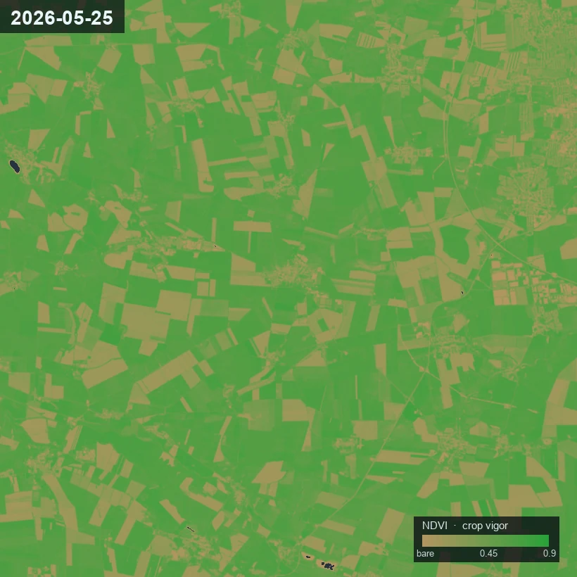
Noticing that a field looks stressed and saying what it will actually yield are two different jobs, and most of the real work happens in the gap between them. A vigour map is an observation — canopy's thin here, dense there, browning early on that slope. It tells you how the crop looks today, nothing more. It doesn't say what ends up in the trailer: a crop can look rough early and recover just fine, or stay lush deep into midsummer and still fail once the grain is filling.
Turning an observation into a forecast takes a model of the crop, not just a picture of it. You have to place that observation inside the arc of the season — what stage the field has reached, what the weather has already taken from it, what the plant still needs to finish — before it becomes a statement about the outcome. The same patch of pale canopy is a minor nuisance at one stage and a disaster at another. A forecast is that placement, done carefully: condition, read against the crop's own timetable, projected through whatever season is left.
Locating a field on its own timetable is itself an established discipline, not a judgment call made by eye. Curve-fitting a season's vegetation-index time series to pin down start-of-season, peak and end-of-season dates — the approach popularised by tools like TIMESAT — is standard practice in the agricultural remote-sensing literature, and studies comparing it against ground-recorded phenology have generally found the satellite-derived dates track the field-recorded ones closely for cereals. Get that timetable wrong and every reading downstream of it is being compared to the wrong point in the crop's development.
This distinction matters because the two things answer different questions. A condition map answers where to look today, which is a scouting question — useful, but limited. A forecast answers what to price, reserve or lend against, which is an underwriting question. An institution can only act on the second one if the first has been carried honestly through the arithmetic of the season, uncertainty and all, instead of just getting repainted as a prediction.
Why the honest answer is a range
Ask what a field will yield, and the temptation is always to answer with one number. That number is almost always wrong — and worse, it hides the thing the question was actually about. Two fields can share the same expected harvest and still carry completely different risk: one a near-certainty, the other something that could turn out excellent or fail outright. A single figure can't tell them apart, even though that difference is basically the entire substance of a premium or a loss reserve.
So the honest forecast is a band — low case, expected case, high case — where the spread between them means exactly what it claims to mean. A tight band is a confident field. A wide one is an exposed field. That width isn't a hedge, and it isn't an apology. It's information, and early in the season, when a lot can still go either way, it's naturally wide — narrowing only as the weeks resolve what actually happens.
Once yield is a range instead of a point, the question a risk desk actually cares about gets a clean answer. Mark the level below which a crop counts as a loss — the trigger point for a guarantee — and the probability of loss is simply whatever share of the range falls beneath that line. It's specific to each crop and each field, because both the threshold and the spread are specific too. That single probability is what turns a forecast into a premium, a reserve or a credit limit, and it's not something you can read off a lone number, because a lone number has no spread to weigh in the first place.
The anomaly is worth more than the number
Ask a risk desk what actually scares them, and the answer is never a raw quantity of grain — it's a departure from whatever quantity they priced. Tonnes per hectare, taken on its own, is really a farmer's number. A heavy soil in a wet district and a light soil in a dry one can both be having a completely normal year at very different absolute yields. The raw figure doesn't tell an institution much until it's set against what that specific field, in that specific place, was expected to do.
So the signal that actually matters is the anomaly — how far the season is running above or below that field's own normal. A premium was priced against an expectation. A loan was sized against one. A supply position assumes one. The absolute harvest can be completely unremarkable while the deviation from expectation is severe, and it's the deviation that triggers the claim, sours the loan, moves the market. Read as an anomaly, a modest field having a terrible year stands out exactly as it should — and a famously productive field having a merely average year stops setting off false alarms.
The anomaly travels well, too. Absolute yields differ across soils, climates and crops in ways that have nothing to do with risk, but deviation from local expectation puts every field on the same scale. That's what makes it possible to rank a portfolio — not by which fields yield the least, but by which are furthest below what was actually underwritten. For a desk holding many parcels across many districts, that ranking is the decision, not the tonnage.
This is what the parametric-insurance literature calls basis risk: the gap between what an index pays on and what a policyholder actually lost. A regional yield anomaly is always a coarser index than any single farmer's true loss, so basis risk can't be engineered down to zero. It can only be measured and priced honestly — which is really the whole argument for reporting a checked coverage figure instead of one confident-sounding number.
The literature actually quantifies this rather than just naming it: work on copula-based dependence between an index and true farm-level loss models basis risk as under-compensation and over-compensation probabilities rather than a single error bar, and a separate line of research on expectile-based payment schemes derives, mathematically, the trigger structure that minimises basis risk for a given index — a reminder that the gap between index and reality is itself an object of active actuarial research, not just a caveat to wave at.
Why the forecast can be trusted
A forecast is only as good as the checking behind it, and crop forecasts are notoriously easy to fake. Map an image straight onto a yield number, score it against a soft baseline, and the result can look great on a slide while behaving erratically the first time weather leaves the range it was tuned on — which is, of course, exactly the drought or heat spike that drives the claims in the first place. The guard against that runs two ways: ground the forecast in how a crop actually grows physically, so it holds together under stress, then test it against outcomes it never saw during training.
"Grounded in how a crop grows" has a specific, decades-old meaning in agronomy: process-based growth models such as WOFOST simulate a crop day by day — light interception, biomass accumulation, water balance — rather than pattern-matching an image to a yield figure. The published research on fusing WOFOST with satellite observations is itself a useful sanity check on what satellite fusion can and can't do: peer-reviewed studies assimilating Sentinel-derived leaf-area-index and soil-moisture signals into WOFOST via an ensemble Kalman filter report winter-wheat yield RMSE falling from roughly 800 kg/ha in the un-assimilated model to the 500–750 kg/ha range once satellite data is folded in — a real, published improvement, and also a reminder that "better" here still means hundreds of kilograms per hectare of remaining error, not a solved problem.
Testing means scoring each season's forecast against the real harvest once it's recorded, region by region — because skill that holds on one landscape can fall apart on another with a different crop, climate or field structure. Every figure carries a stated uncertainty, and that uncertainty gets checked, not just asserted: a band that claims to contain the true outcome nine times in ten actually has to do that, across many fields and many years. A band that's quietly drawn too narrow is worse than no band at all, because it sells false confidence in exactly the tails that matter.
One distinction is worth stating plainly here. A reading taken down to the single parcel is a calibrated estimate — useful for ranking fields and flagging trouble — but it picks up more uncertainty the finer it goes. The number that's actually been measured against real harvest records, the one you can stand behind, is the regional one. And where the data is thin — persistent cloud, tiny or mixed plots, a short history — the honest move is to say so and flag the field, rather than quietly papering over the gap.
| WAY OF KNOWING | WHAT IT SEES | BEFORE HARVEST? | DOWN TO A FIELD? |
|---|---|---|---|
| The official count | the harvest, once it is in | no, it arrives after | a region, averaged |
| A farmer's walk of the field | this field, by eye | yes, but only here | one field at a time |
| A weather-driven guess | rain and temperature | yes, but indirect | a region, not a parcel |
| The crop read from orbit through the season | condition, week by week | yes, as it grows | to the field, as an estimate |
What a calibrated band actually promises
Calibrated is a precise claim, not a mood. A band is calibrated when its stated coverage matches its real coverage: an interval that claims to contain the true harvest nine times in ten has to, counted across many fields and many seasons, actually do that — not less often, which is false safety, and not much more often either, which just means the band was drawn too wide to say anything useful. The width has to mean what it claims, or the probability of loss you read off it is fiction.
This isn't a new problem. Weather forecasting solved it decades ago with named scores, and we hold our bands to the same ones — the Brier score for a binary threshold (will the loss exceed X, yes or no), and the CRPS (continuous ranked probability score) for the full distribution rather than one cut-off. Both scores punish false confidence, not just being wrong.
To illustrate the idea, not to report a published result: a point estimate of "4.2 t/ha" tells an underwriter nothing about the downside. A calibrated 3.8–4.6 t/ha band at 90% coverage tells them exactly what to reserve against — and unlike the point estimate, its coverage claim can actually be checked against recorded harvests and shown to hold or fail. We publish our own bands' checked coverage on the validation page as each crop and region clears our internal bar.
This is also why honest uncertainty is a commercial asset rather than a weakness. An institution doesn't need a forecast to be certain — it needs the forecast to be honest about how certain it is, because that honesty gets priced straight into the premium, the reserve, the haircut on a loan. A provider willing to admit when a field is unreadable, widen the band while the season is genuinely still open, and let its coverage record be inspected, is one whose bands can actually be trusted once they finally narrow. Confidence that never gets checked is just marketing.
The alternative fails at the worst possible moment. A band tuned to look tight in an ordinary year breaks in the drought year — the year the claims actually arrive, the reserves get drawn down, the questions get asked. Trust with an institution builds the slow way: state the uncertainty, let recorded harvests grade it, accept the verdict. A forecast that survives that treatment doesn't need much of a sales pitch. Its record is the pitch.
What it changes
Moving the moment of knowing earlier changes who can act, and when they can act. A crop insurer can price the field it actually holds before the season resolves, and read a probability of loss off a range it trusts instead of a regional average that only shows up after the cheque's already written. A lender can size a loan to the low case instead of the hopeful middle — lending against the crop that's plausibly there, not the one everyone's hoping for. A grain buyer can form a view weeks before the official estimate lands, reading whether a country's fields are running above or below their own normal while there's still time to trade on it.
The biggest stake here is also the quietest one. Food security is, underneath everything else, a forecasting problem: a government that sees a shortfall coming in July has options a government surprised in October simply doesn't — releasing reserves, easing imports, steadying a market before panic sets in. Reading a crop from orbit doesn't change the weather, and it doesn't grow more grain. What it does is move the moment of knowing forward, from the season after the harvest to the months before it — which is the only window where anything can actually still be done.
FOR CITATION
The number arrives too late. A harvest sets prices, premiums and loans, but it is counted only once the crop is in — after the decisions that depend on it are made.
The honest forecast is a range. A low, expected and high case, with a probability of loss read as the part of the range below a client's threshold — not a single confident figure.
Trust comes from checking. Figures are tested against recorded harvests region by region, uncertainty is stated and verified, and the parcel-level read is marked as an estimate while the regional figure is the validated one.
This is the public briefing.
The subscriber report carries the season-long condition read per field, the forecast band with its low, expected and high case, and the probability of loss against your own threshold — region-validated, with each figure's stated uncertainty checked rather than asserted.